Contrast is one of the most important principles in visual art. It refers to differences between elements in a composition that catches the viewer’s attention. Contrast can be used to direct the viewer’s eye, create emphasis, and make a work more dynamic and engaging. There are several types of contrast that artists utilize to achieve different effects. This article will explore some of the key principles and uses of contrast in art.
Light and Dark Contrast
One of the most basic types of contrast is between light and dark values. Having areas of light and shadow creates definition and modelling that gives a three-dimensional quality to artwork. Darker values also tend to recede in space, while lighter values come forward. Dramatic contrasts between light and shadow can create a sense of drama and spotlight a certain area as the focal point. The strong chiaroscuro lighting effects used by Baroque painters like Caravaggio demonstrate the emotional impact light and dark contrast can have. More subtle gradients can also be very effective.
Colour Contrast
Contrast between different colours is another important principle. Complementary colours like red and green are strong contrasts as they contain no common hues. When placed next to each other, they make each other appear more vibrant. Other bold colour contrasts include warm and cool colours and saturated colours versus muted, neutral colours. Using a split complementary scheme or triad colours that are far apart on the colour wheel is a way to create maximum colour contrast. Subtle colour contrasts can also be created by using low saturation, soft hues or colours that are close together on the colour wheel. The impressionist painters were masters of using delicate colour contrasts to capture the ephemeral effects of light.
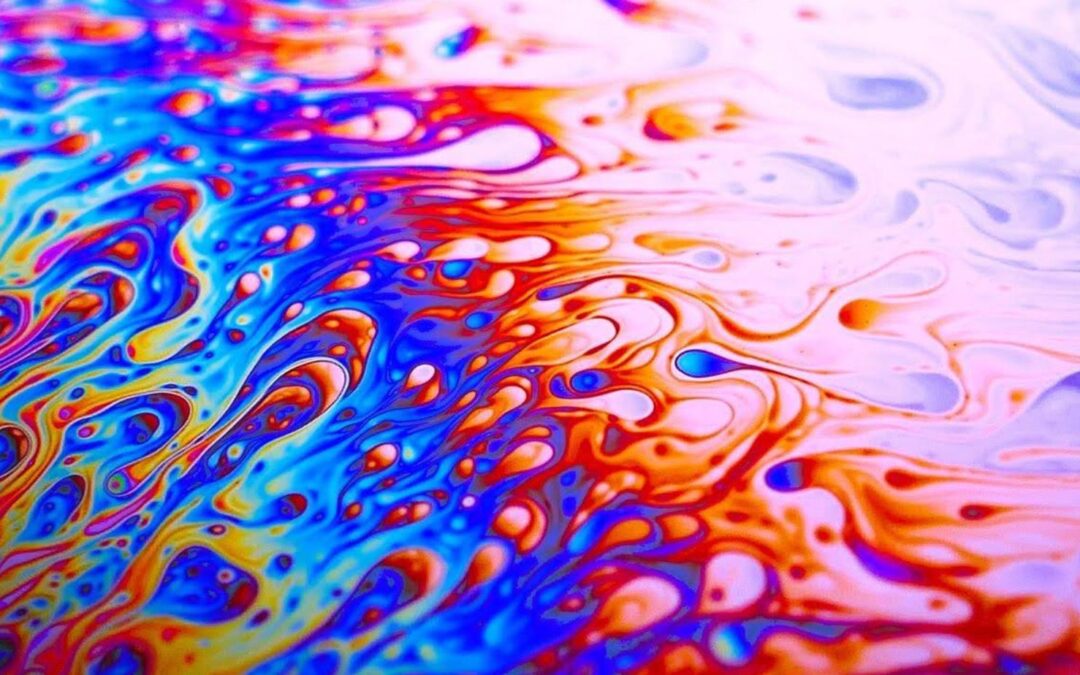
Cool and Warm Colour Contrast
Related to colour contrast is the contrast between warm and cool colours. Warm colors like orange and yellow visually advance in space and feel energetic. Cool colors like green and blue recede in space and feel more serene. Juxtaposing warm and cool colors makes both seem more intense. Historical paintings often used this contrast between warm foreground colors and cool, muted backgrounds. Cool colors tend to feel more modern as well. Contrasting cool and warm colours is an effective way to create colour harmony and dynamism.
Texture Contrast
Contrasting textures make a work more tactile and interesting. Some examples include smooth vs. rough, soft vs. hard, and glossy vs. matte.
A composition can be made more dynamic by combining highly textural painterly brushwork with smooth, flat graphic shapes. Using textural contrast sparingly can also create emphasis. Sculptures and mixed media work often utilize multiple textures. Overall, clever use of textural contrast adds visual interest and variety.
Size Contrast
Varying the sizes of elements creates contrast that helps direct the viewer’s attention. Larger shapes tend to dominate smaller shapes, so size contrast can create emphasis. Size contrasts are useful for establishing scale and depth as things appear smaller as they recede into the distance. Dramatic size contrast where some elements are much larger than others can convey a sense of power or importance. Using evenly sized shapes can create harmony, while irregular sizes are more dynamic. In summary, manipulating size contrast is a simple yet powerful way to control the composition and meaning of an artwork.
Shape and Form Contrast
The outlines of shapes create contrast with the surrounding space. Curved organic lines contrast with straight geometric lines and angles. Forms can contrast between rectangular and cylindrical, or natural and manmade. Shape and form contrasts create visual interest through variety. They can also communicate meaning and emotions, like the tension between the jagged shards and rolling hills in a landscape painting. Understanding how to utilize shape and form contrast gives artists more tools for composition and expression.
Contrast of Subject Matter
Subject matter itself can create contrast, like an object set against a background or two people engaged in different activities. Juxtaposing contrasting themes or placing something unexpected in a setting creates interest. A sense of narrative or metaphorical meaning can emerge from contrasting subject matter. Collages and surrealist paintings often rely on strange combinations of contrasting subjects, like a clock melting against a landscape to convey temporality. Contrast between different subjects helps construct meaning and focus attention.

Understanding and harnessing principles of contrast gives artists great power over a composition’s look and feeling. Contrast can make artwork more appealing, guide the viewer’s eye, create emphasis and communicate ideas. Both dramatic and subtle contrasts have important uses. Mastering contrast allows artists to compose images with clarity, movement and visual impact. Whether using light and shadow, colour, texture, shapes or subject matter, the thoughtful use of contrast is a key to creating captivating works of visual art.