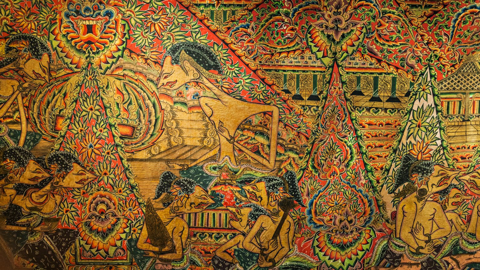
Historic art has helped to shape modern-day graphic design in more ways than one. It’s influenced various major brand logos that are now widely recognizable worldwide.
Art Nouveau Movement
The Art Nouveau movement uses delicate curves and organic forms to create art. With attention to intricate detail, modern-day brands have embraced this aspect in packaging design. The key idea behind this is to provide art to the masses. After WW1, it influenced other artistic movements, such as Art Deco. Alphonse Mucha was a prominent artist within the genre, and he had a major impact on packaging design. Perrier-Jouët is known for its stunning packaging, featuring flower motifs that draw inspiration from this movement.
Art Nouveau-style typography can also be seen within the entertainment sector, with sans-serif fonts such as Helvetica and Gills Sans taking a backseat to more playful and exciting fonts. Music artists including Lorde have adopted this style, and it can also be seen in the logo of fantasy and nature-inspired games. Some of them include Blue Wizard Megaways and Magic Powers Megaways. The commitment to more decorative elements is also present in packaging and graphic design, especially with barber products and craft gins.
Companies are able to stand out by adopting a particular style of art so that they can resonate with their audience. This has helped to trigger new art movements, especially in the world of label design. The craft gin boom is just one example of how traditional art forms have resurfaced over time. Overall, it’s evident that the lasting influence of the Art Nouveau movement in modern design continues to shape brand identities and modern design.
The Evolution of Cubism
Cubism has helped to usher in a new era for modern art. It left a lasting legacy and encouraged the use of bold shapes, bright colors and overlapping elements. One example here would be Picasso’s Les Demoiselles d’Avignon. This work breaks away from traditional composition, with five women and a slice of melon on an upturned tabletop. Picasso’s Cubist technique has helped to inspire others to create logos that utilize fragmented elements. Adidas is a prime example here, as the brand uses fragmented shapes within its logo. The three stripes are stylized in a way that suggests dynamism, which is a prime influence in Cubism.
Cubism has helped brands across the world to stand out from the crowd, with Nespresso using a cubist-inspired ad with a fragmented coffee cup for their Cubania range. Mercedes-Benz also uses Cubist imagery for their A-Class model range advertisements. They adopted a Cubism approach to show the car from multiple angles, in an attempt to showcase the sleek design and new features. The bright and bold geometric shapes used in cubism can also be seen in other graphics, especially in the entertainment sector.
In conclusion, it seems that the past is a huge reservoir of inspiration. Brands can connect with both the hearts and the minds of consumers by using traditional art movements to inspire their graphic design.


